Dexegen: from chaos to release in three months
Three designers had worked on the product before us. What was left was 100+ screens that disagreed with each other, and a release date that had already been promised. We aligned the visual language, standardized the system, and shipped the features that made trading worth repeating
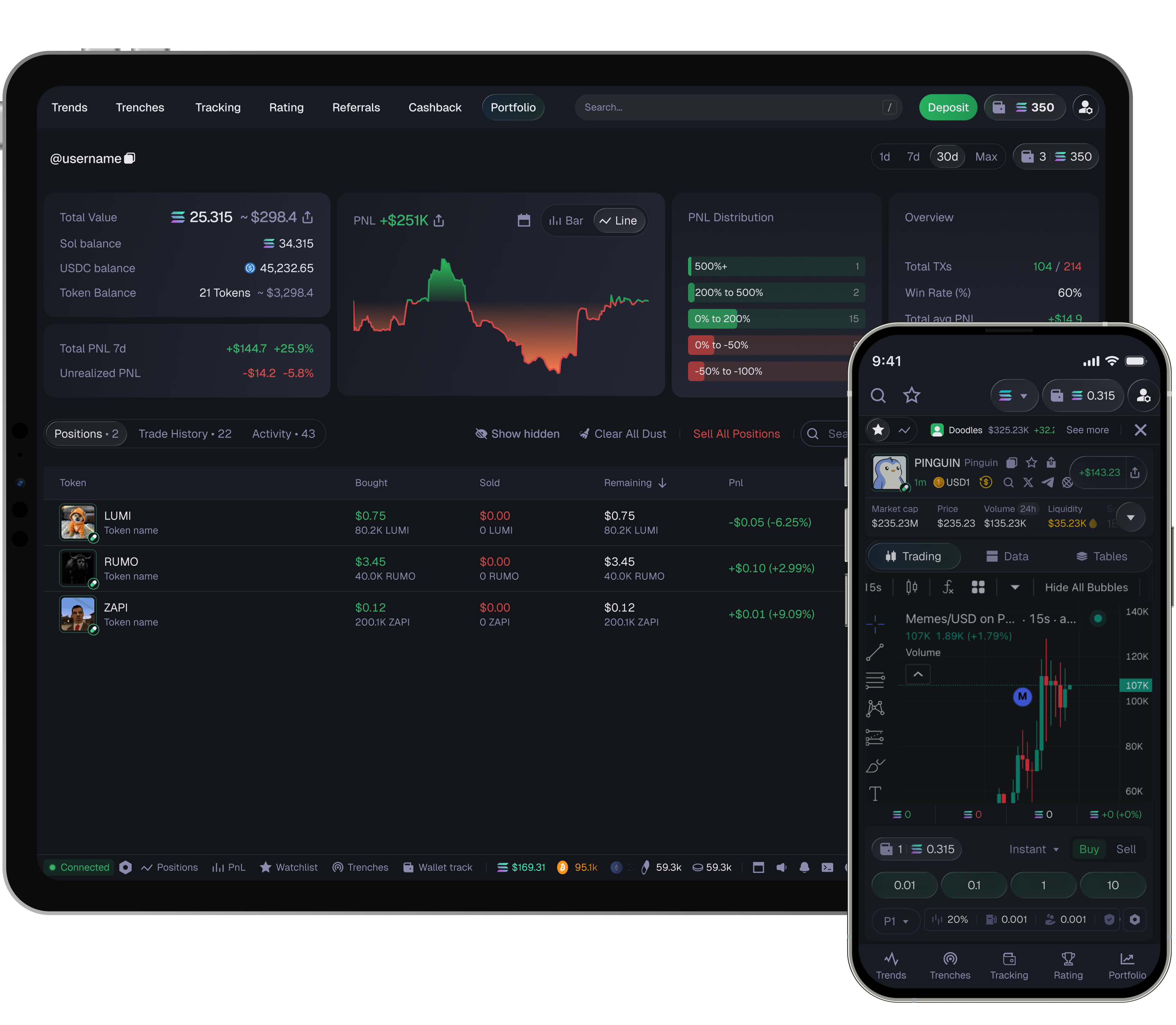
Audit, redesign, new flows and features, product growth
Competitor analysis began the day after the first call
Audited, standardized and brought under one system
Fee revenue grew after new order types reached the trading flow
A race for the crypto market
The product was heading for its first release while competitors were already live and earning. Launching weaker than them on core functionality made no sense, and inside there were three conflicting approaches and no shared system
- Three design languages and no shared component system: one change meant making it in nine places
- On core functionality the product fell short of those already live
- The key flows lacked whatever brings a trader back
- A refreshed visual layer and a flexible system, so development would not wait on design
- Catch up with competitors on core functionality and beat them in a few places
- More executed trading actions, because platform revenue is fees
A redesign without losing development speed
The brief was not "redraw everything from scratch" but to pull the product into a coherent system, fast. We standardized the patterns and components that repeat, and the team kept shipping releases the whole time
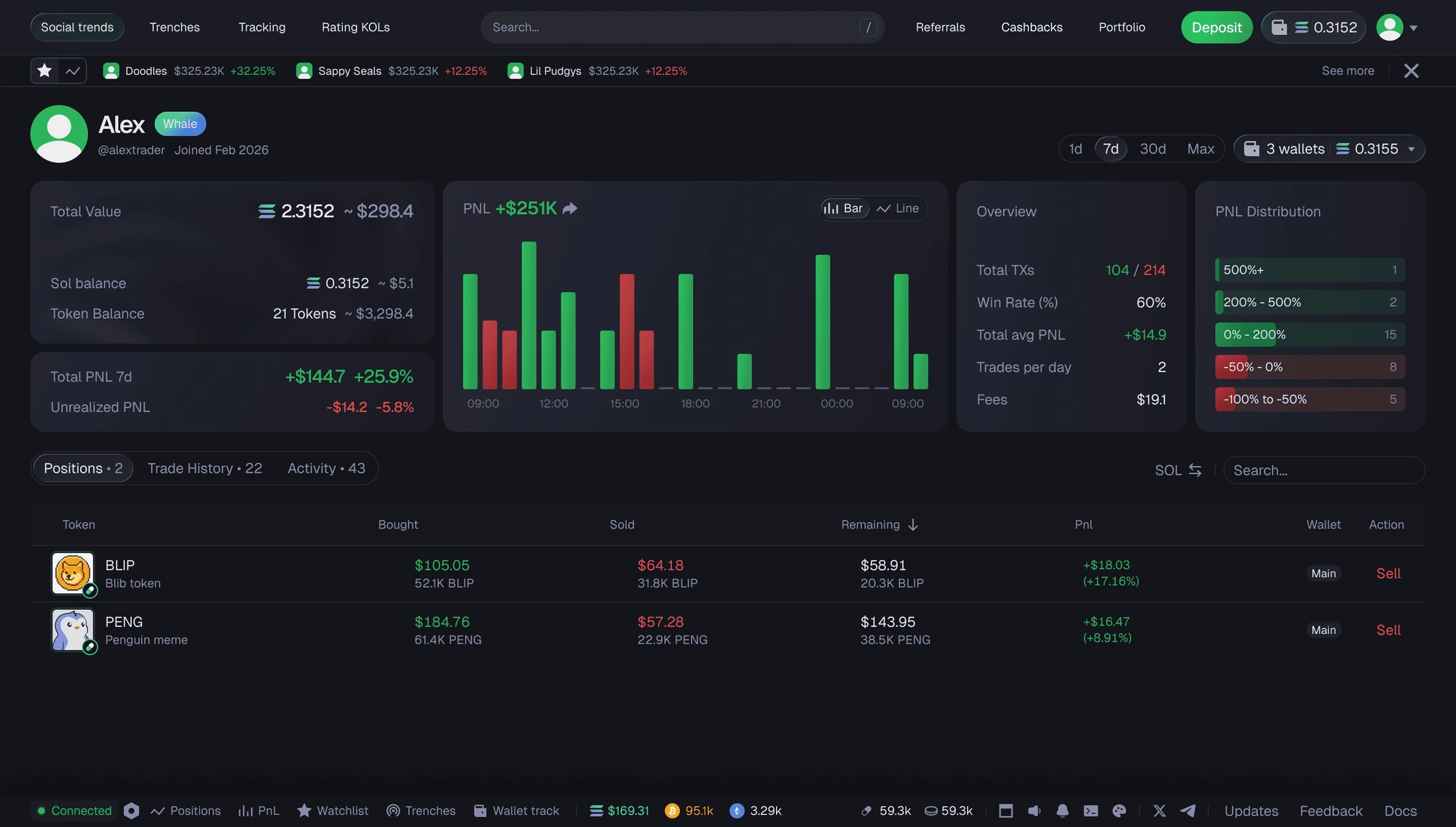
An overloaded screen with fragmented blocks and weak visual hierarchy. The key numbers get lost among secondary data and are not easy to scan at a glance: the interface reads as heavy, and assembled from local fixes
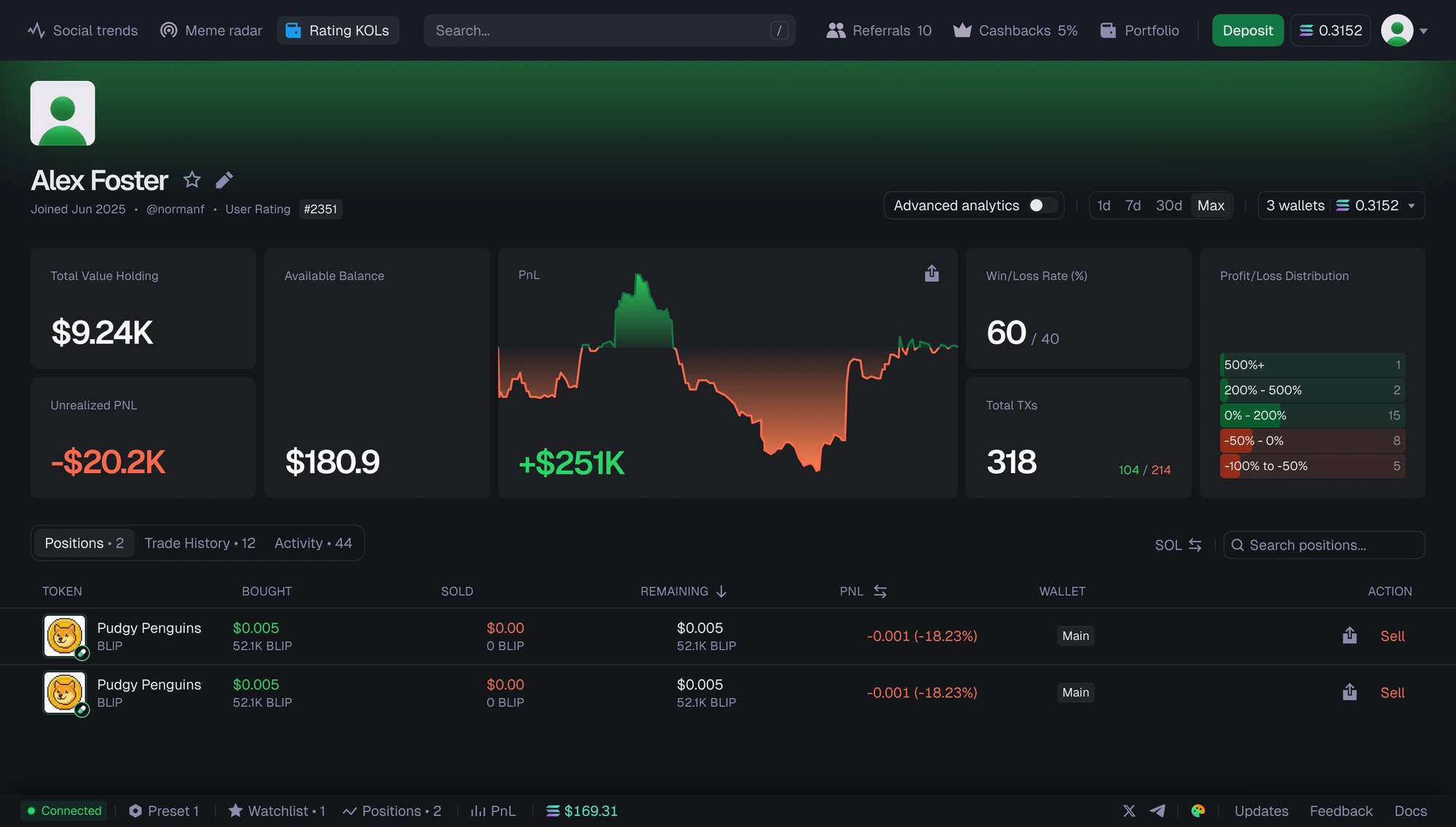
A cleaner, more structured screen built around the numbers a trader actually acts on. The hierarchy is explicit, the analytics that were buried are now visible, and the daily workflow is readable in one pass
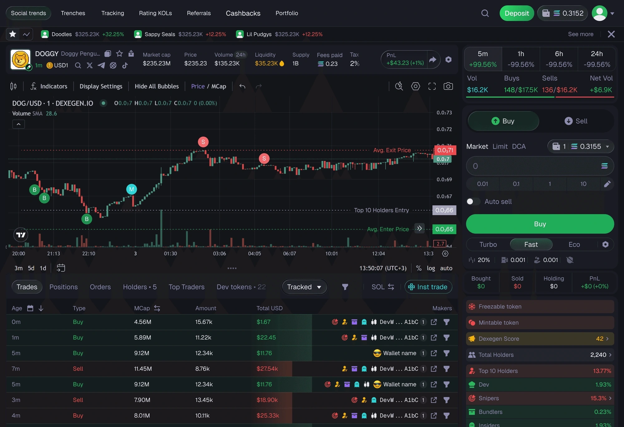
Chart, holder analytics, a live trades feed and the order panel at once, none of them shouting. Hierarchy is carried by weight and spacing rather than by color, in a market this red and green, color was already spoken for. Everything a trader checks before pressing Buy is one glance away from the button
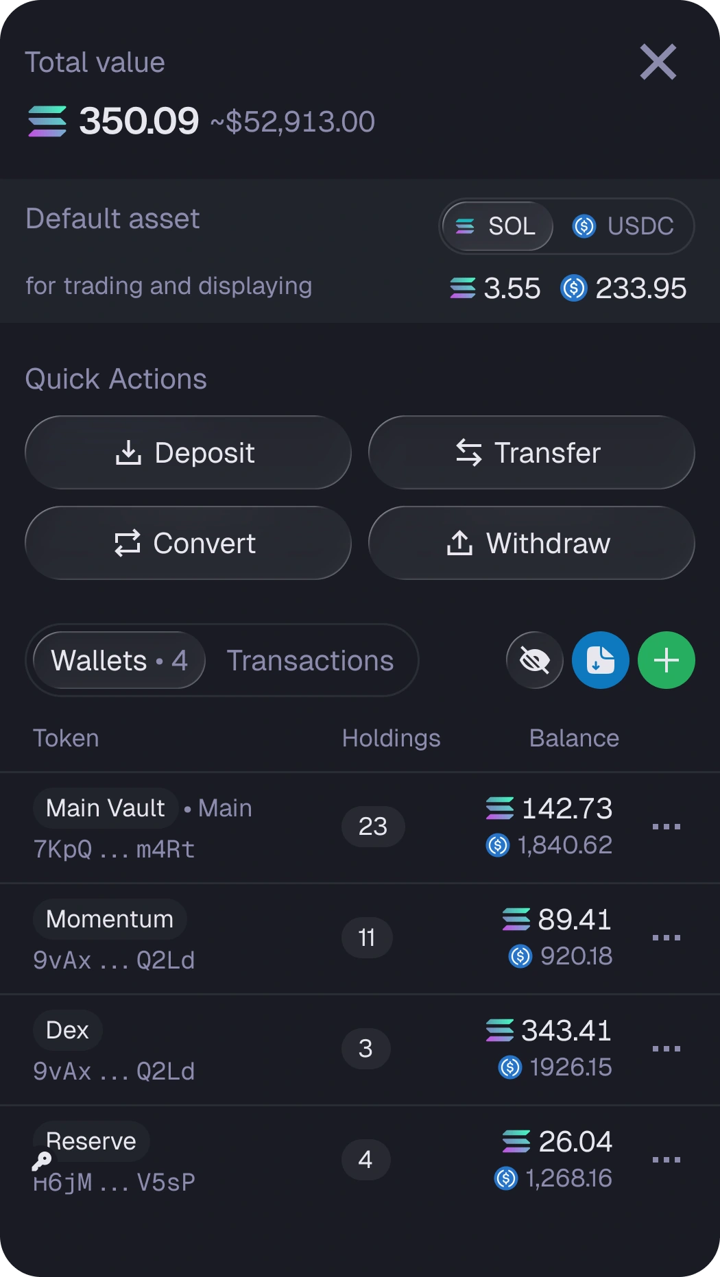
Total value, the default asset and the four wallet actions come before the list, so funding and transfers are always one tap away
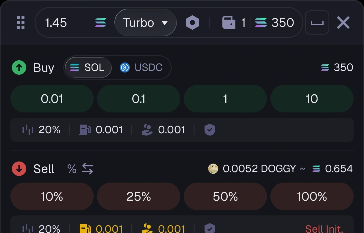
Preset amounts, slippage and fees in one strip, buy above and sell below. The panel opens over any screen, so acting never means leaving what you are looking at
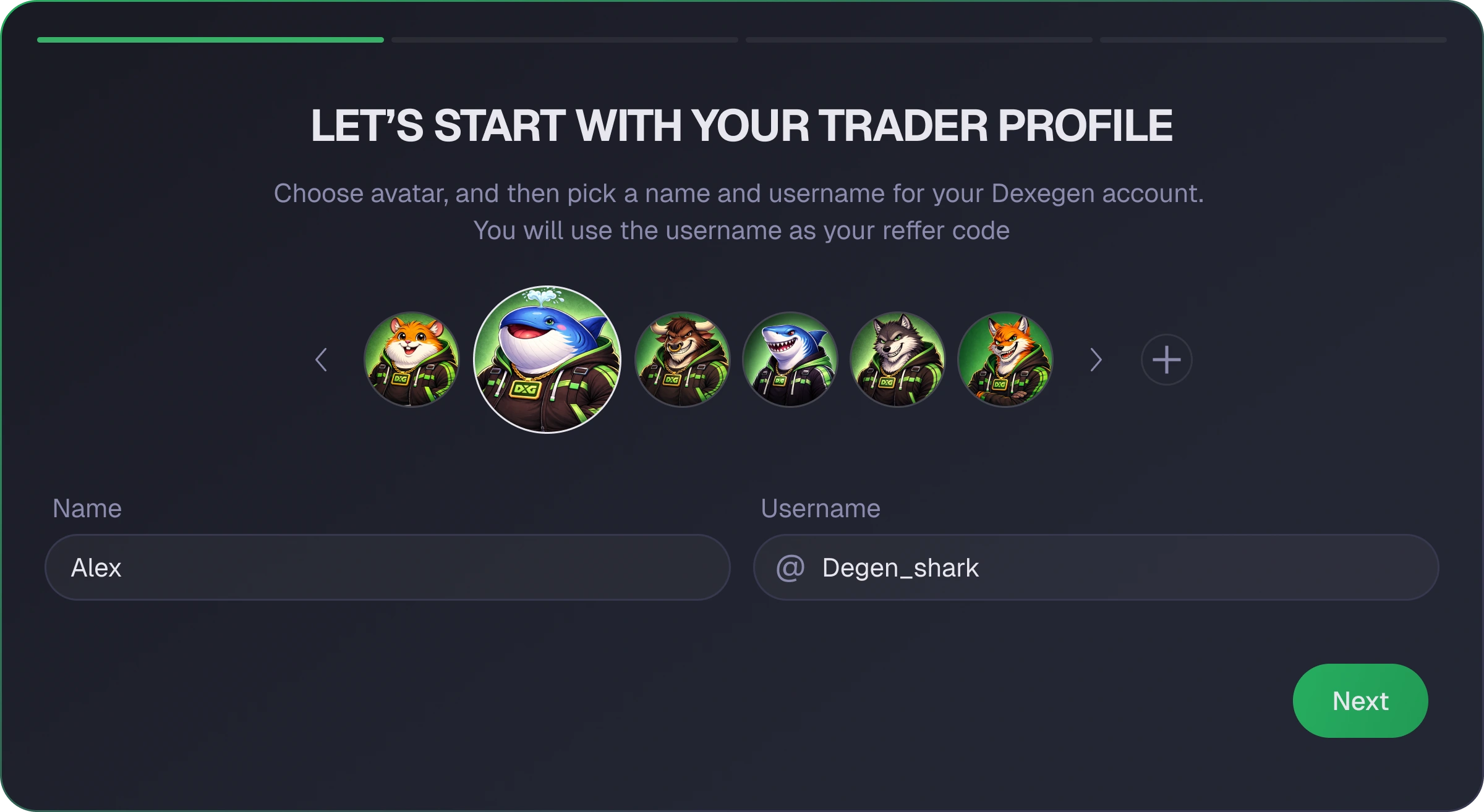
Avatar, name and a referral-ready username are set in one short step. The flow gives a new trader a recognizable profile without turning setup into a separate journey
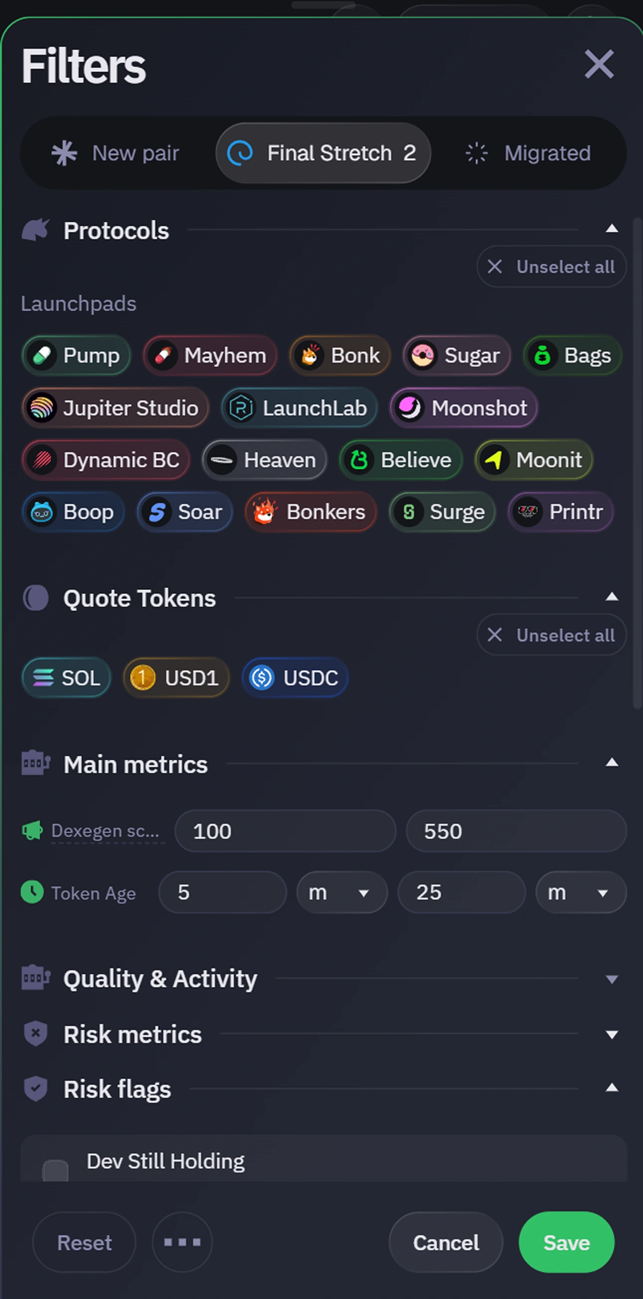
Protocols and quote assets stay visual and scannable, while deeper metrics remain grouped below. A dense market search becomes a sequence of quick, reversible choices
Conditional orders lifted revenue
A DEX earns on trading fees. So the product question was not "what else can we add". It was: how do we increase the number of executed actions without making the interface heavier? We introduced a new order type: conditional execution
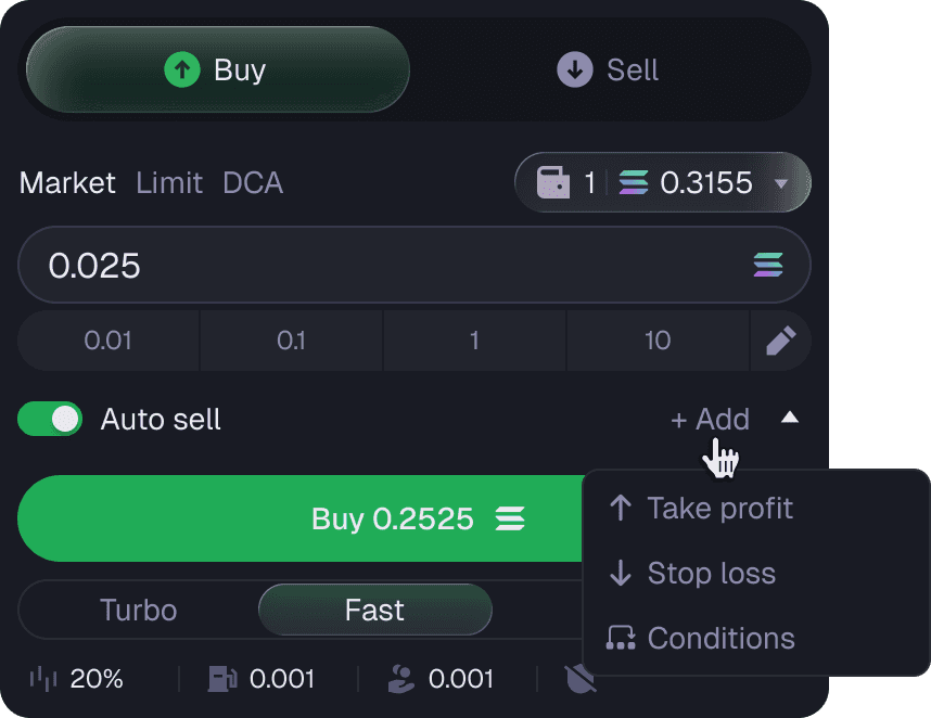
Advanced order types Conditions sit beside take-profit and stop-loss, so the new capability is discovered in place rather than taught in a tutorial
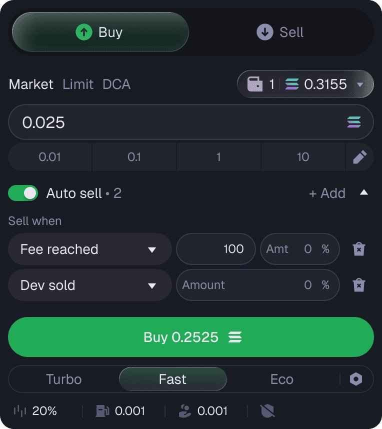
Automatic market monitoring Fee thresholds, developer sell-offs, market-cap triggers
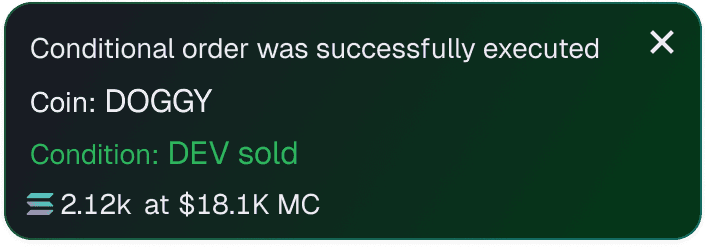
The user comes back The notification is the return trigger: the order fired, and there is a reason to open the product again
fee revenue after the new order types launched. At launch, most competitors still did not offer conditional orders The interaction model was also tested with a focus group of 100 traders before launch, February 2026
The flows that decide whether people trust the product
In a self-custody product trust is not decided by dashboards but by wallet creation, the recovery phrase and regaining access. A mistake here can cost the user their funds. That is where we started
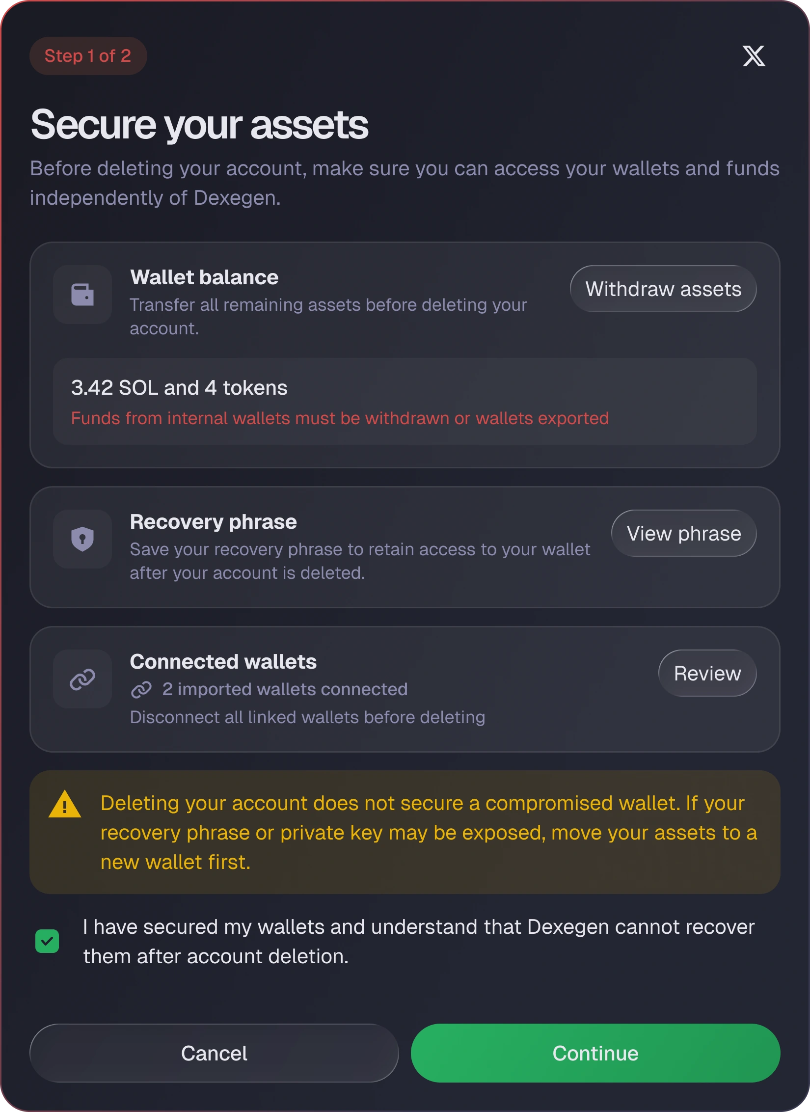
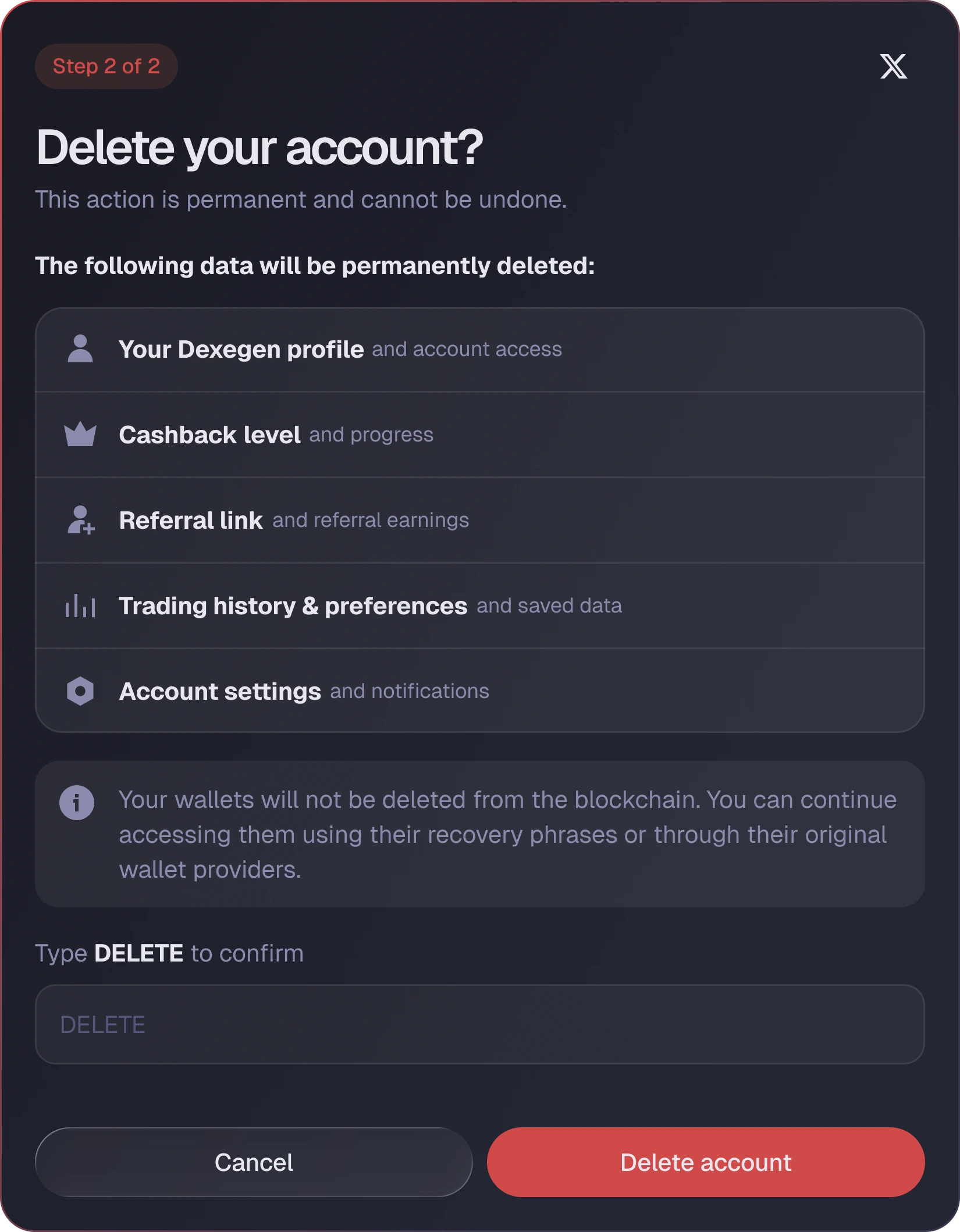
The features we shipped
The release pace meant reading the market quickly and shipping only what moves activation, retention and everyday value
Chart, order book, holder analytics and the order panel on one screen
Market, limit, DCA and the conditional execution that changed the numbers
Total value, realized and unrealized PNL, positions and trade history
New tokens across every launch platform, on a single page
What the market is talking about, ranked and time-stamped
Tagged wallets, live activity and alerts without leaving the terminal
Opinion leaders scored on reach, call quality and risk
PNL cards a trader builds, styles and posts from inside the product
Cashback wired directly into the trading flows
What it gave the product
Instead of disconnected screens, the platform became one coherent system: clearer for new users, more convincing for active traders, and easier for the team that has to keep releasing
More reasons to trade, an edge over competitors, and fee-revenue growth traceable to a specific trading feature
A scalable design system and standardized flows: features ship faster, and changing one thing stops meaning changing it in nine places
Faster trading and faster scanning, new capability through conditional orders, and a product that finally holds up on a phone
What we actually did
UX audit & friction map
Competitor analysis from day one, then a pass over 100+ screens to find where the product contradicted itself and where the product was losing money in its key flows
Product redesign
One visual language across the platform, rebuilt around scanning speed, with the release schedule untouched
Design system
1000+ elements covering every state and scenario, so the team could ship features without re-deciding the basics each time
Feature & flow design
20+ features worked through end to end, including the conditional order type that changed the platform’s fee revenue